SPECIAL EDITIONS
The Special Edition range is where things get experimental. It is Vocation’s creative space to push boundaries in brewing, design and everything in between. I work closely with the brew team on each release, from the first spark of an idea to the final can on the shelf. Every element is considered, from the artwork to the storytelling and flavour notes, all crafted to work together as one.
Each beer starts with an original concept and it is my job to bring that to life visually. I lean into bold illustration and expressive typography that captures the character of the beer. I want each can to do more than look good. It needs to grab you, even from across the aisle.

DEATH BY CHERRIES
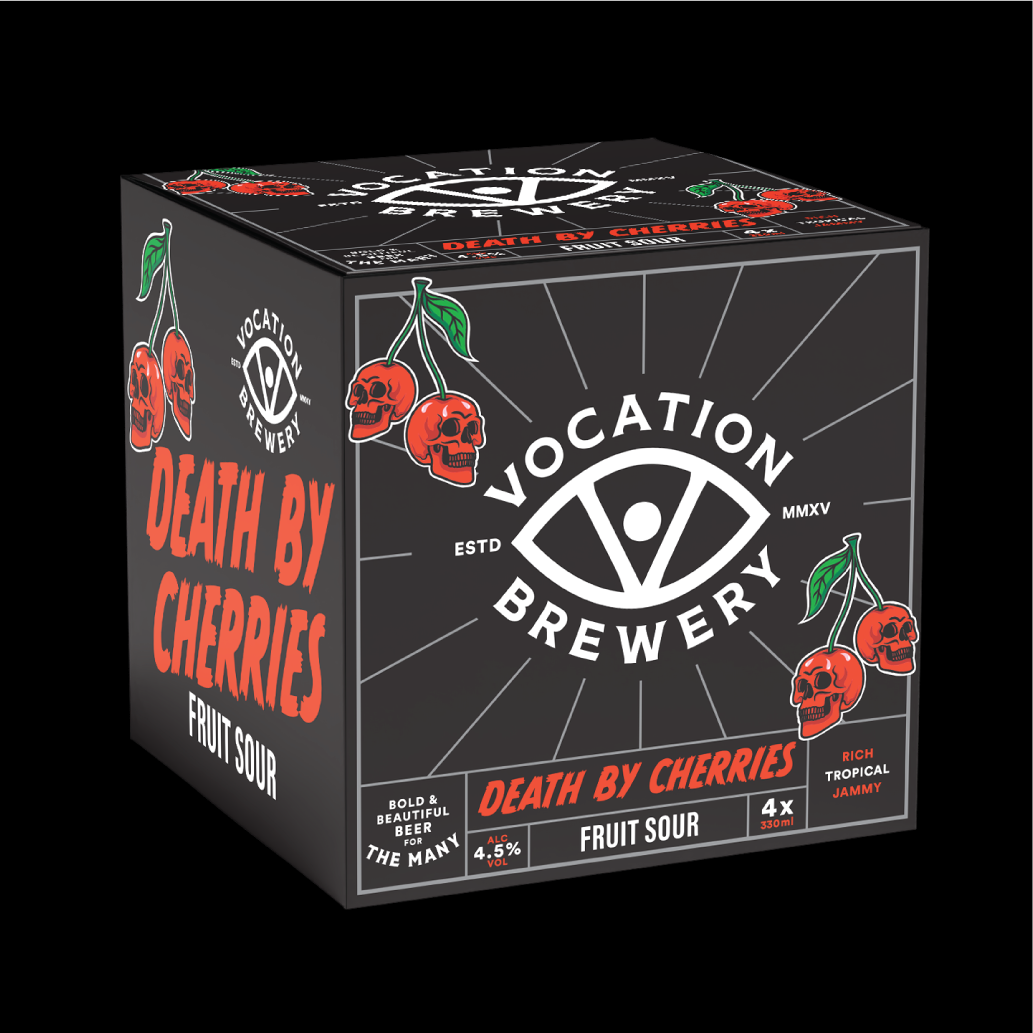
One of my first projects at Vocation was the challenge of designing a bold identity for a new Cherry Sour. After sitting down with the brew team, I set out to create a design that would match its intense sweet and sour character. My task was to bring that intensity to life through design. After exploring several ideas, Death By Cherries was born. The concept that a beer could be so good it’s deadly stood out to me, which led to the creation of the skull-shaped cherries. Set against a deep black background, the bold yet simple illustration gave the beer a rebellious edge that caught the eye across all sales touch-points.
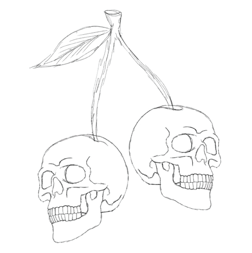
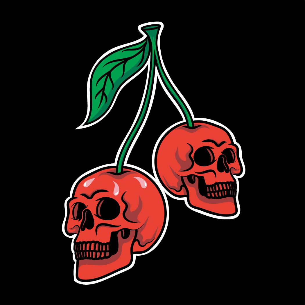
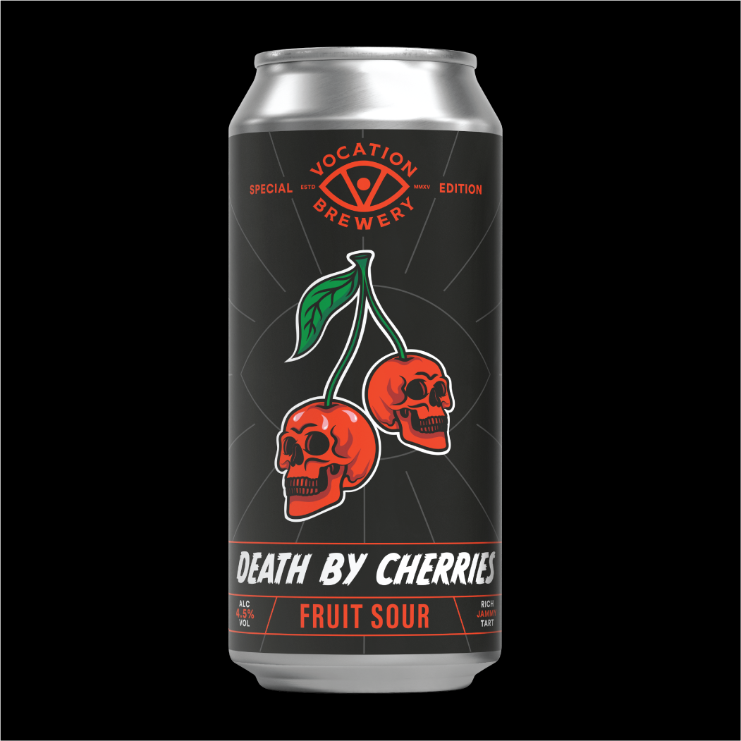

The combination of striking design and strong branding helped Death By Cherries become an instant hit. What began as a one-off release quickly turned into one of Vocation’s best-selling sours. Its success in supermarkets led to growing demand, securing a permanent spot on the shelves of some of the UK’s biggest retailers. The beer continues to expand into new formats, including 4-packs and 330ml cans, allowing it to reach an even wider audience.
Following this, the ‘Death By’ series was created, with new flavours like Pineapple and Chocolate & Chilli putting their own spin on the original design. This project shows how a strong visual identity can turn an experimental product into a standout name.


AORAKI & TARANAKI
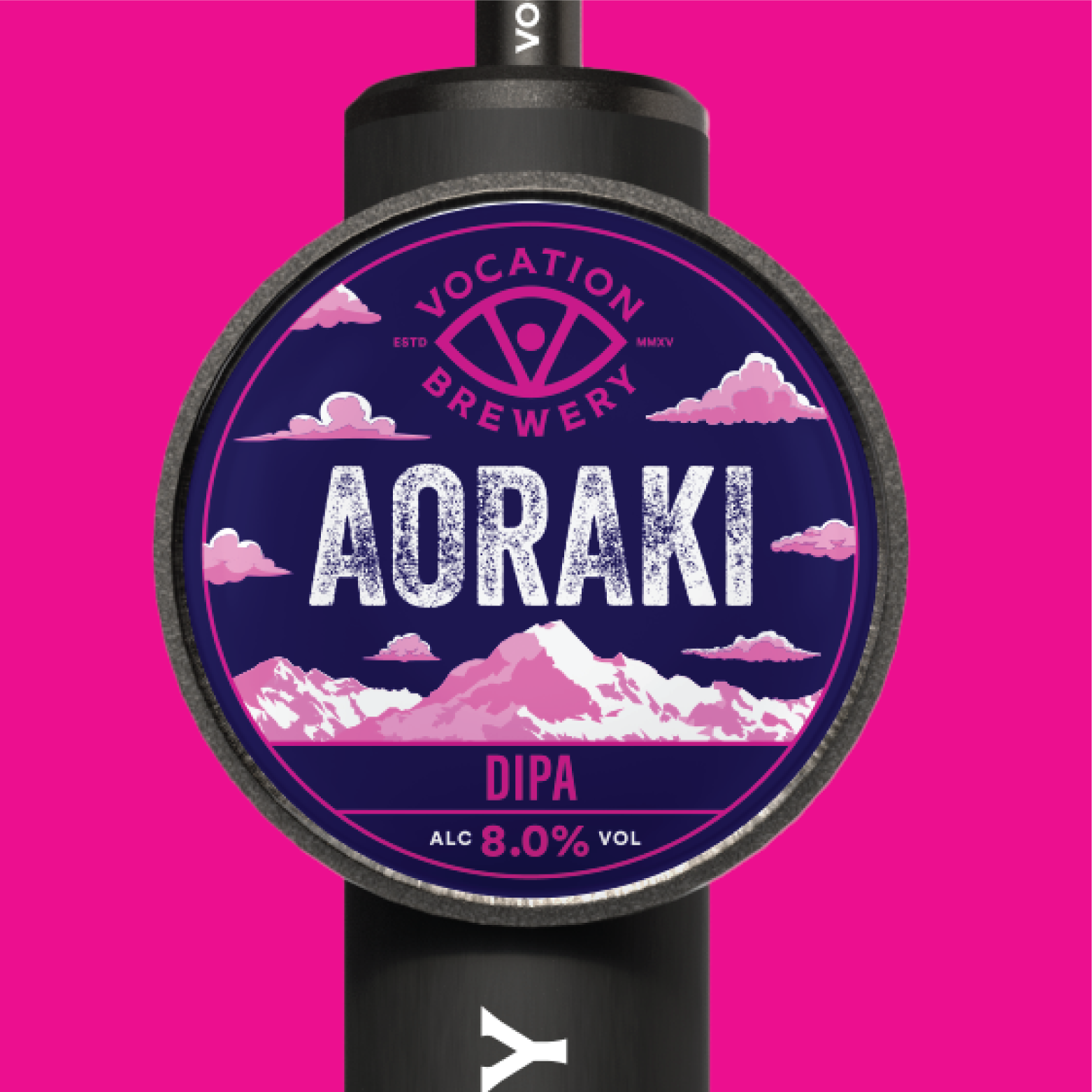
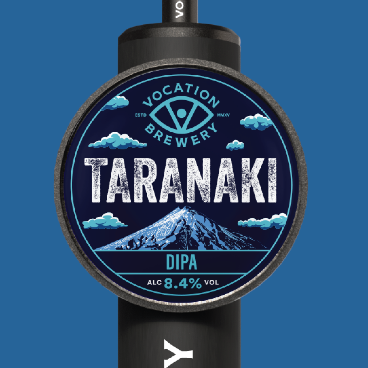
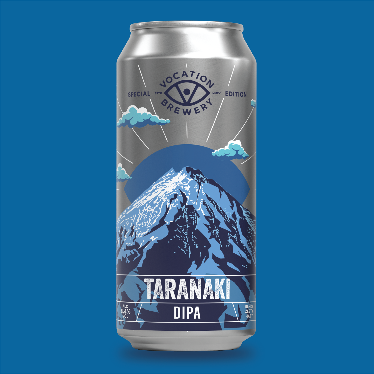
Vocation often releases beer series that are connected in both style and design. Aoraki, launched in 2021, was inspired by a New Zealand mountain range and created to showcase new hops from the region. When I joined the team, I was given the opportunity to refresh the design—retaining the original mountain concept and colour palette, but introducing a more illustrative style.
Following Aoraki’s success, we’ve released multiple follow-ups, each reflecting the origin of their hops. The latest in the series, Taranaki, showcases my evolving design approach with a more refined layout, deliberate use of space, and bolder, contrasting colours. Both designs are clearly connected yet visually distinct, each with a strong identity and standout shelf appeal.

EQUINOX
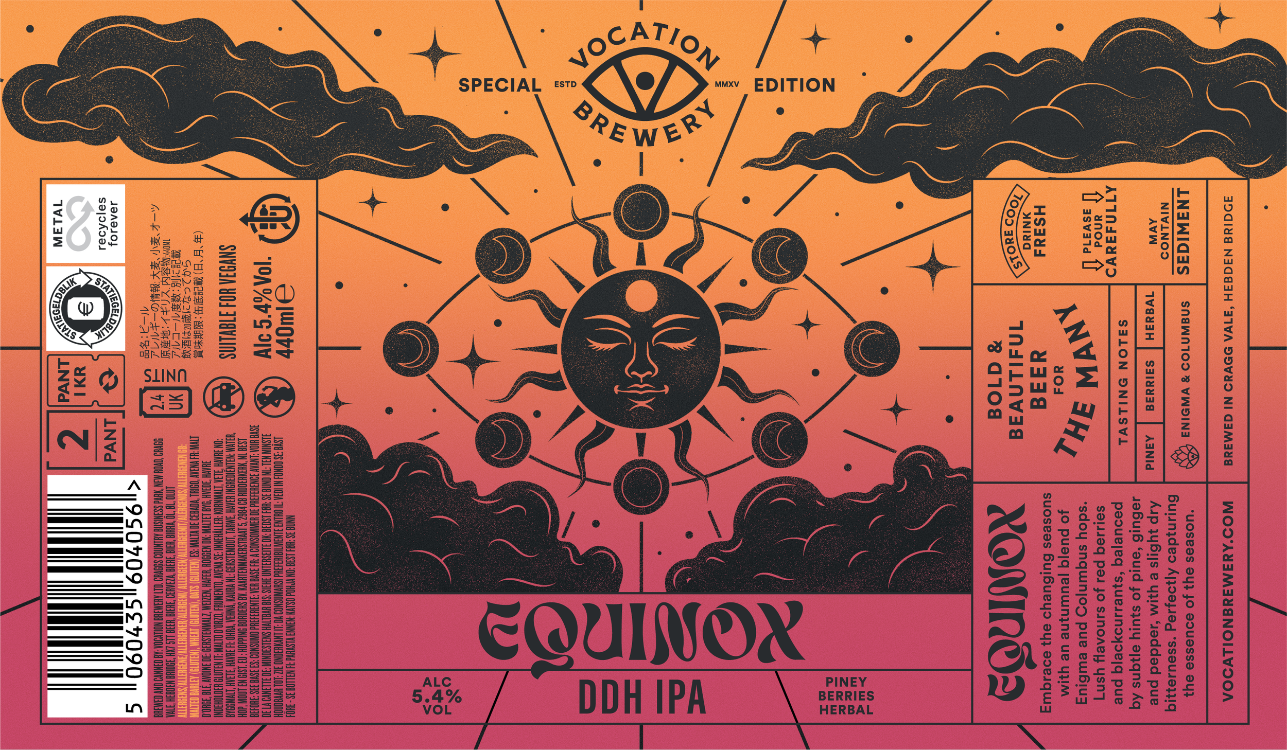
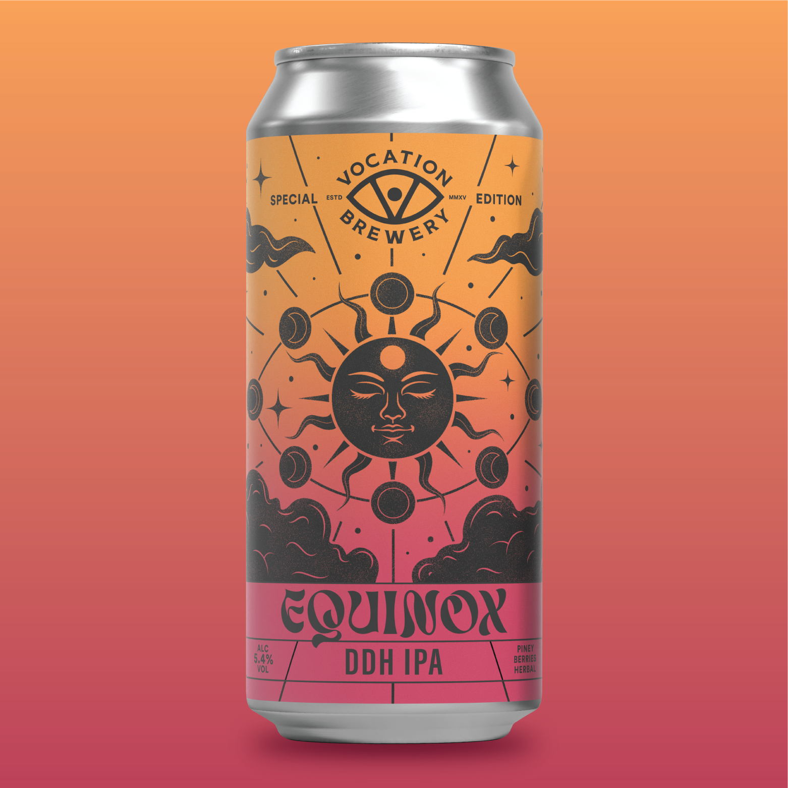
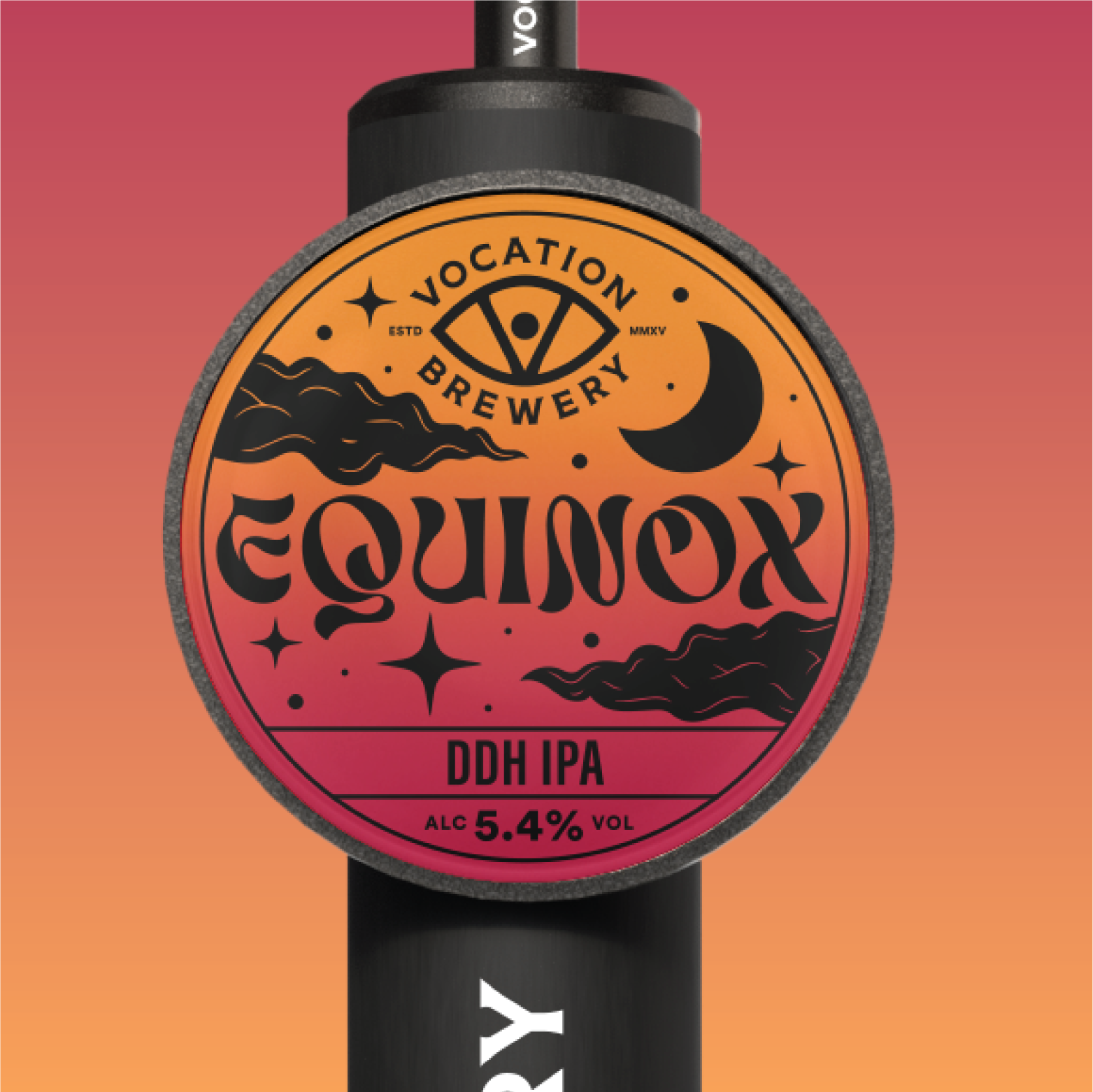
Alongside being a fantastic beer, Equinox stands out as one of my most rewarding design projects of 2024. I wanted to challenge myself creatively, pushing my skills in new directions, and this brief gave me the perfect opportunity to do so. From the moment I received the details - the recipe, backstory, and flavour profile - I knew this beer needed a design that truly embodied its essence. As an autumn release, I drew inspiration from the Autumnal Equinox, a moment of perfect balance when day and night are equal. This idea of equilibrium became central to the design, guiding my exploration of autumnal hues, shifting light, and the mysticism surrounding seasonal change. I aimed to visually capture the feeling of crisp autumn air, the transition of nature, and the deep-rooted symbolism of the equinox itself. The final design weaves together warm, earthy tones with eye-catching mystic elements, evoking both the coziness of the season and the cosmic significance of this celestial event.
COCKTAIL RANGE
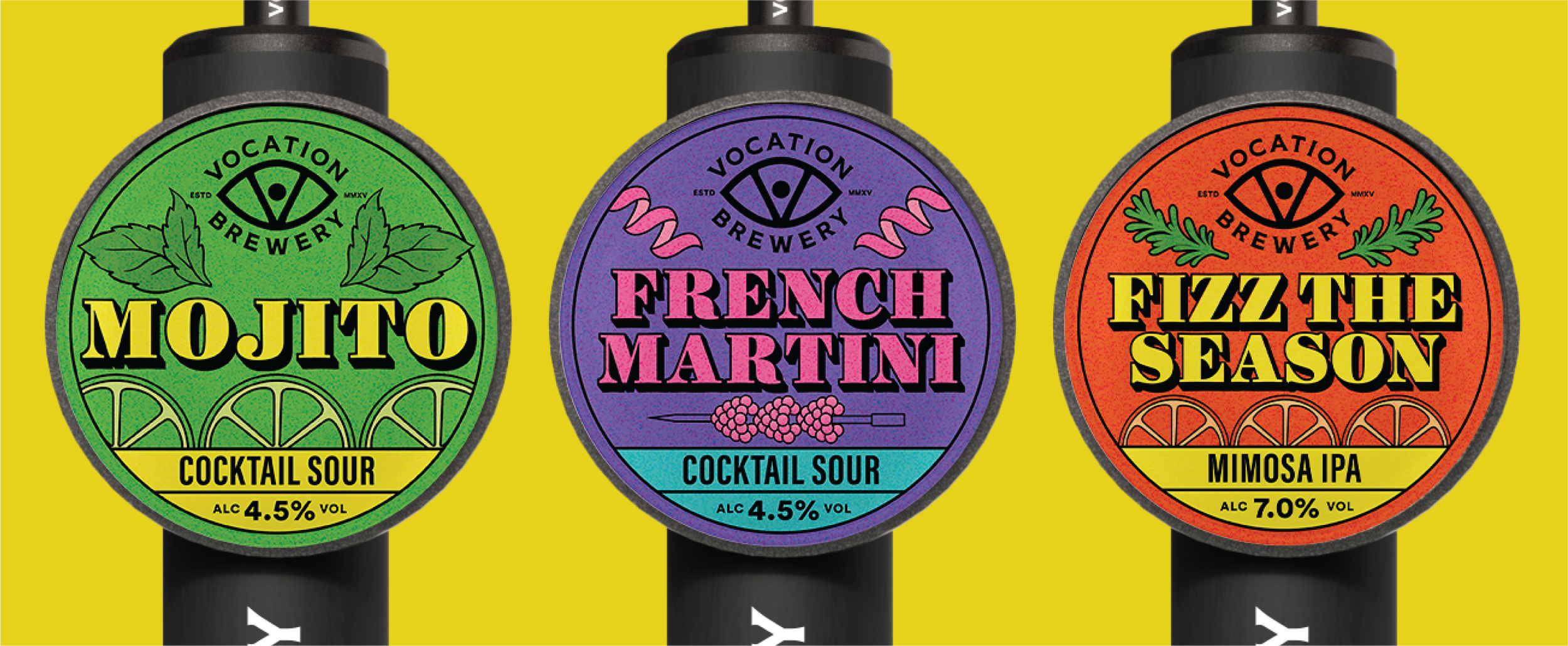
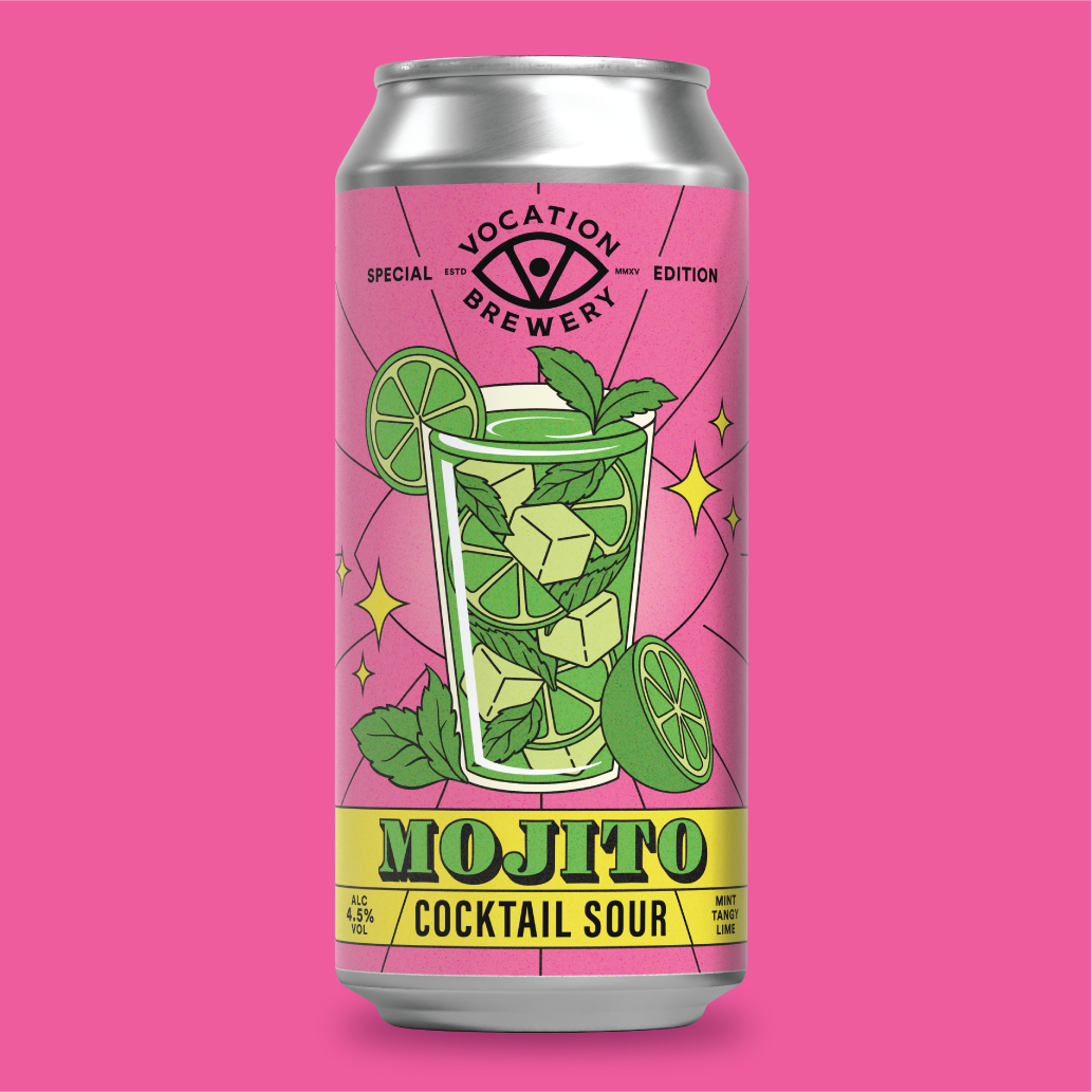
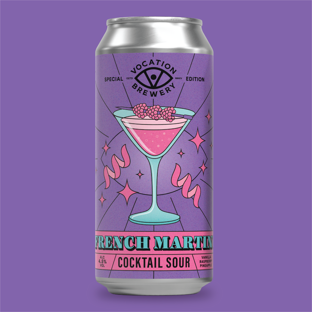
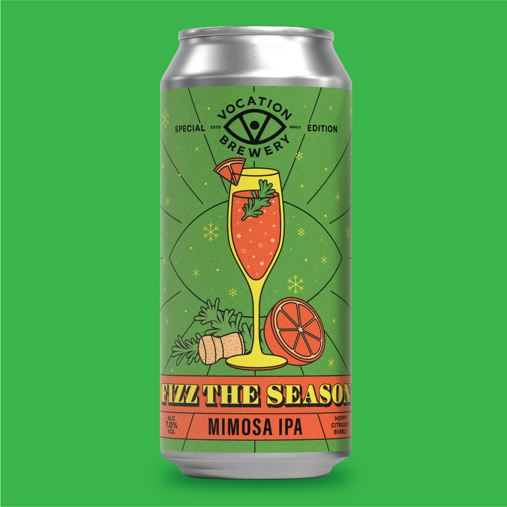
A leading supermarket chain sought Vocation’s unique and innovative beers, leading to the creation of the Cocktail Range. The concept blended classic cocktail flavours with a modern hoppy twist, and the design had to reflect this boldness. Inspired by 1920s cocktail posters and typography, I developed a vibrant visual identity with rich colours and dynamic illustrations, giving each can its own distinct colour while maintaining a cohesive look across the range.
Following two successful launches, we introduced Fizz the Season for Christmas, a festive take on the classic mimosa. The design kept the signature style of the Cocktail Range while adding subtle holiday touches to make it stand out. It was a major success and quickly became a standout addition to the collection.
The Special Edition series evolves constantly. New brews, new briefs and new ways to push things creatively. Whether I am building a concept from the ground up or finding fresh takes on an existing range, I always aim for designs that feel bold, well crafted and unmistakably Vocation.