BRAND CREATION
Rolling Dough is a retro-inspired, skate-fuelled pizza pop-up that serves hot slices with serious style. It’s more than just a place to eat, it’s a mobile slice of culture - built around community, creativity, and a love for good food and good times. With its signature red and cream van, a crew of skate-obsessed mascots, and a lineup of stone-baked, hand-tossed pizzas, Rolling Dough brings bold flavour and high energy to every curb it pulls up to.
As the designer behind Rolling Dough, my goal was to create a brand that channels the raw, rebellious spirit of 70s skate culture while staying irresistibly fun and visually distinct. The concept lives at the crossroads of nostalgia and street style - where pizza meets pavement. Everything from the visual identity to the packaging system is crafted to feel like a collectible.
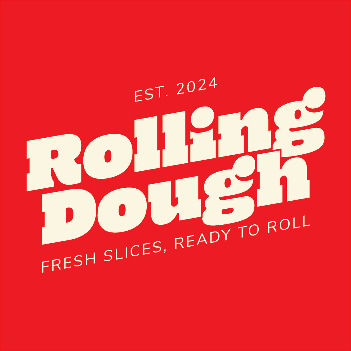
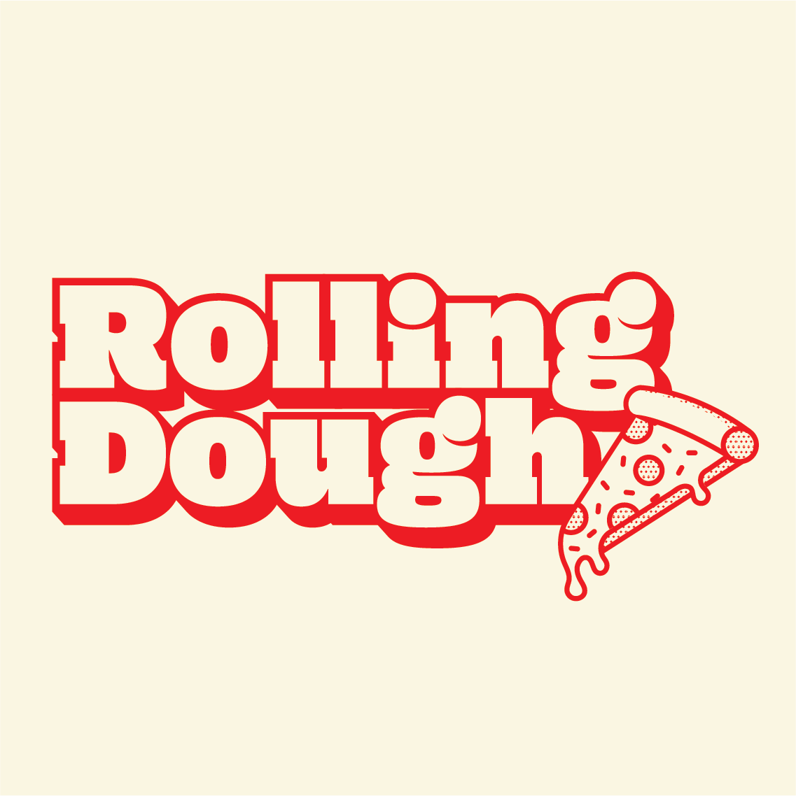

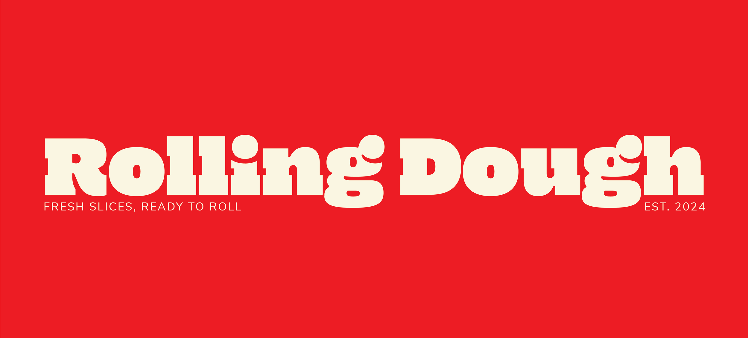
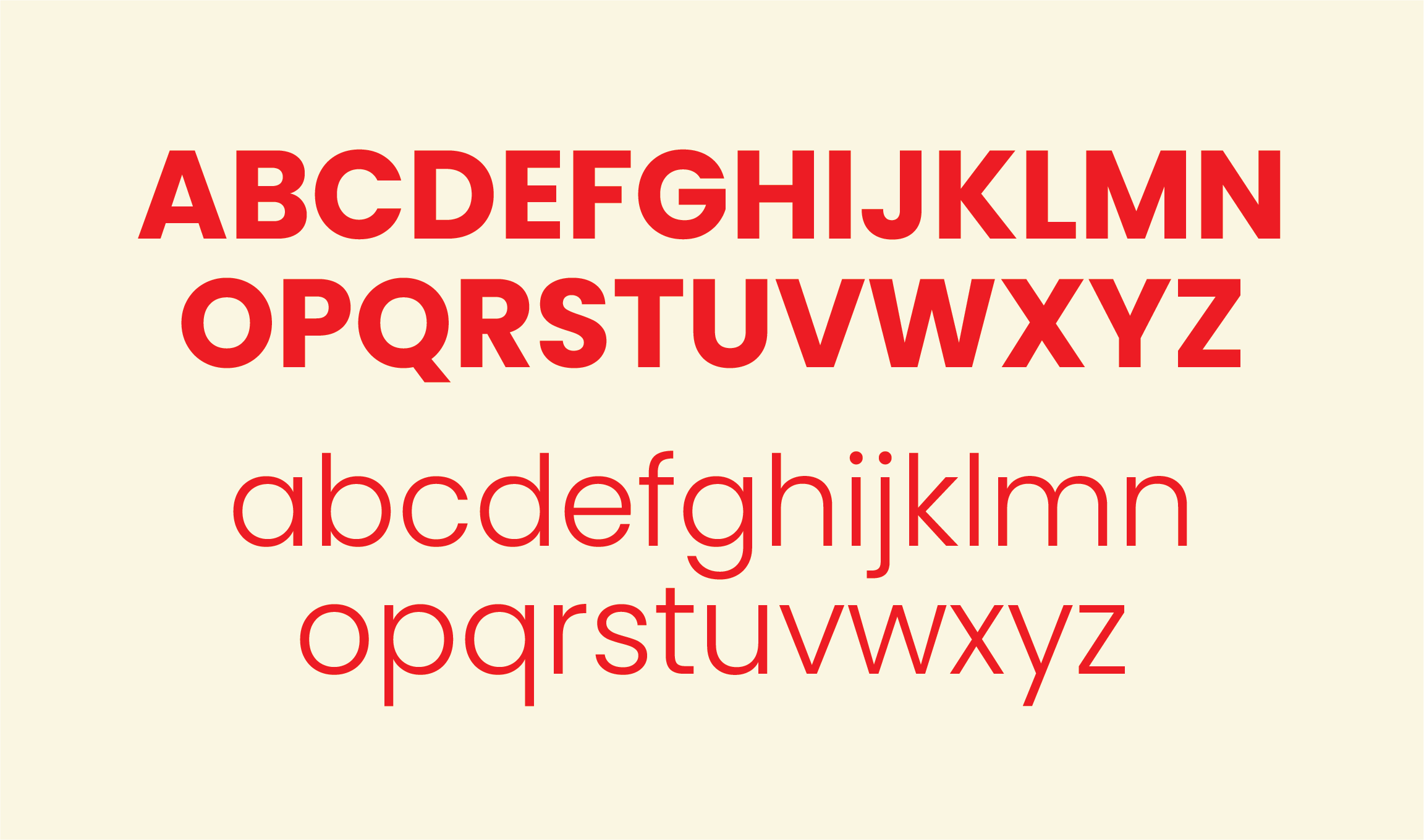
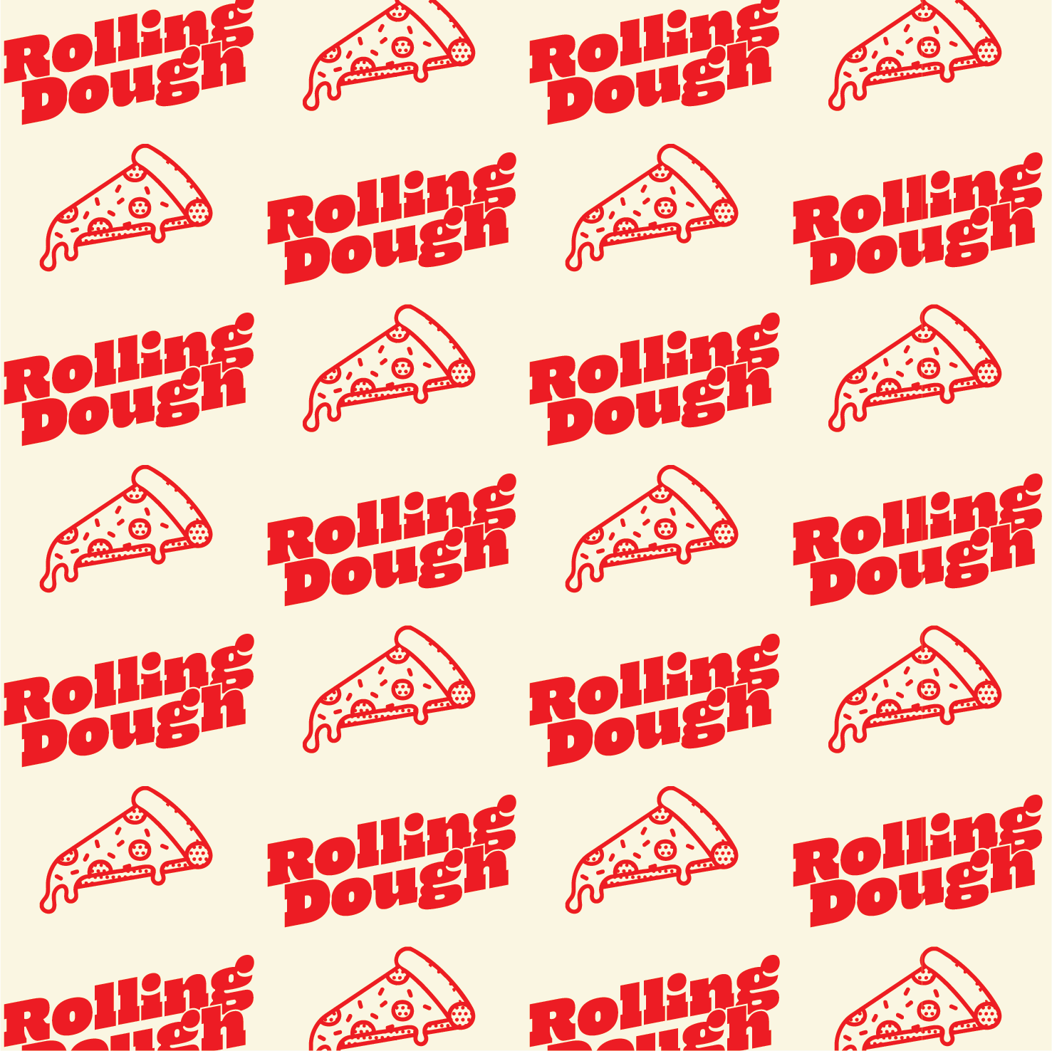
The foundation of Rolling Doughs brand was built around capturing a nostalgic vintage feel with a fresh modern twist. The design process began with bold, chunky typography inspired by old-school diners and retro skate stickers, setting the tone for a confident and playful identity. A simple yet striking red and cream colour palette gave the brand instant recognisability while allowing every visual element to stand out. From there, logos, icons and patterns were developed to feel interconnected, each reinforcing the energy of the brand. Together these elements create a strong visual language that works across every touchpoint, bringing consistency, character and a clear sense of identity to everything from packaging to posters.

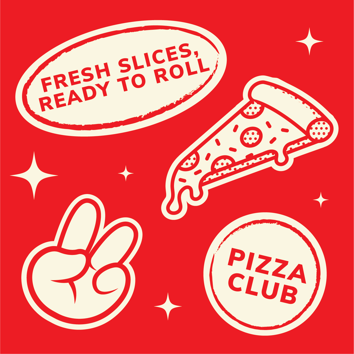
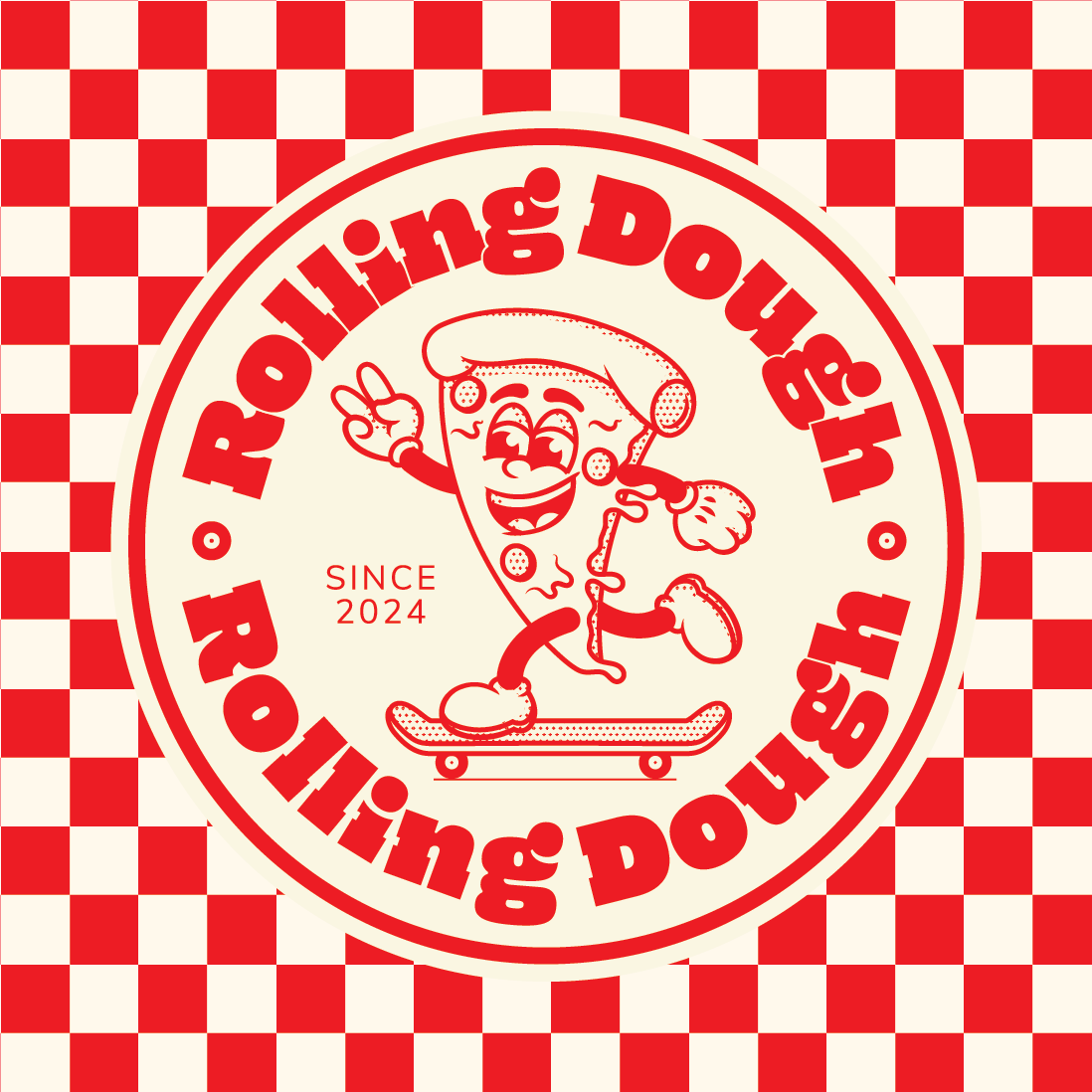
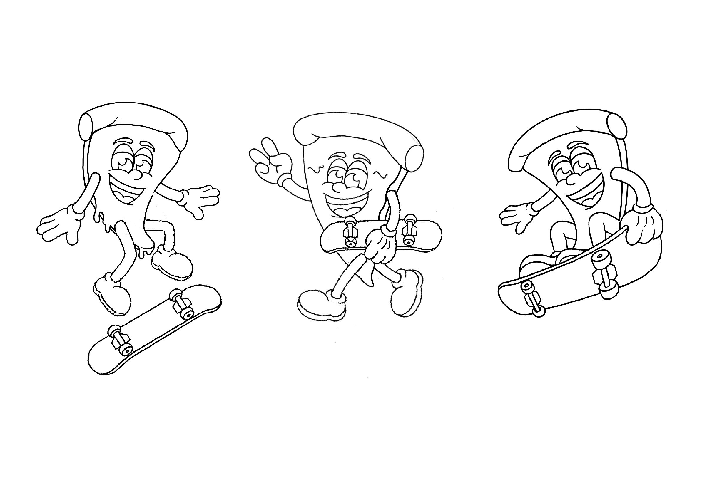
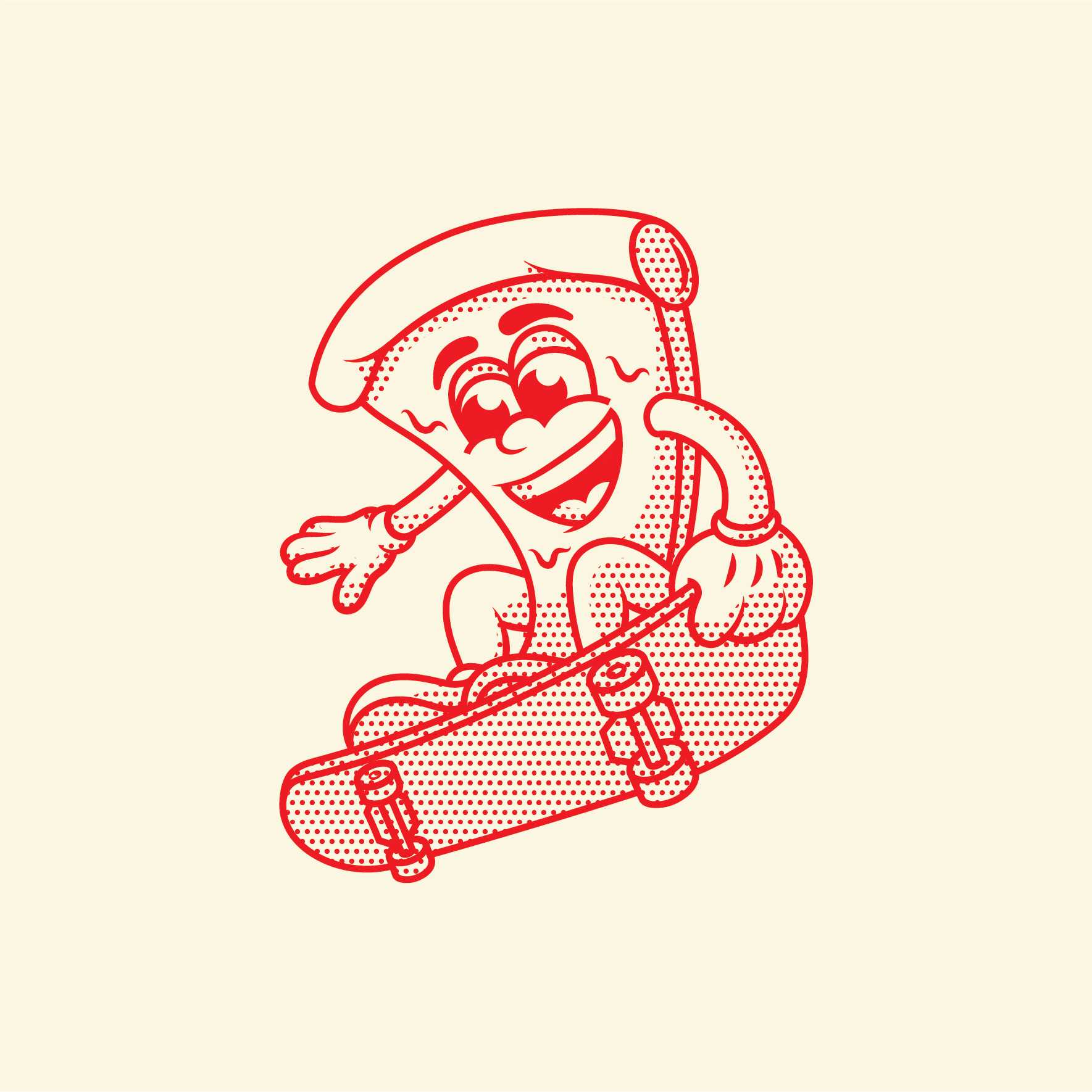
Alongside the logos, patterns and iconography it felt essential to create a mascot that brought the brand to life and added a strong sense of character. The skating pizza slice became the perfect fit. After exploring a variety of poses and actions I developed a mascot that felt dynamic, expressive and captured the spirit of street skating. The vintage sketch style gives the character a unique edge and helps the mascot stand out from more traditional pizza branding. Whether printed on packaging or worn on a t-shirt the mascot gives Rolling Dough a recognisable face and a sense of personality that is playful bold and full of energy.


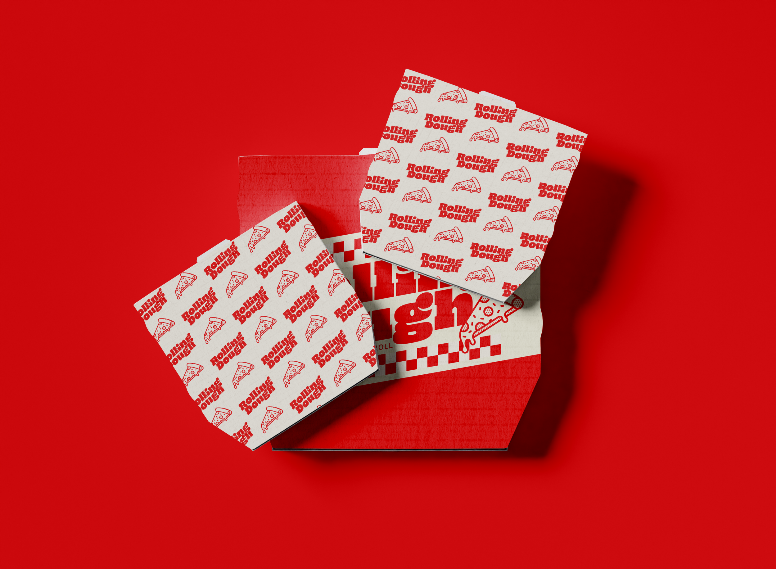
PACKAGING & PRINT MEDIA
The established brand identity shaped every part of the packaging and print design, bringing the logos, icons, mascots and patterns to life in a bold and cohesive way. Each item was designed to feel unique and collectible, something customers would want to keep and remember, while still staying true to the core visual style. The result is a consistent yet varied range of boxes, menus, flyers and extras that all feel like part of the same playful world.
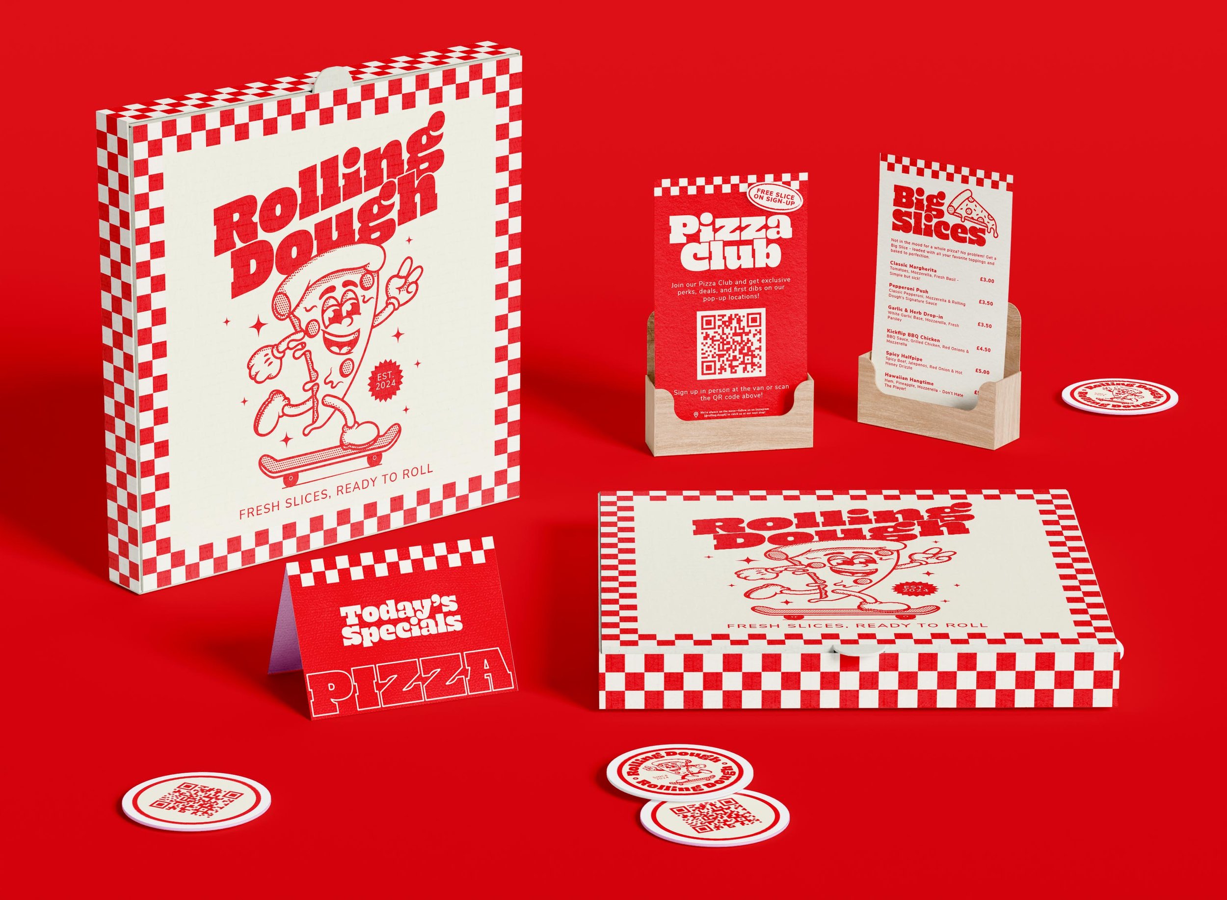


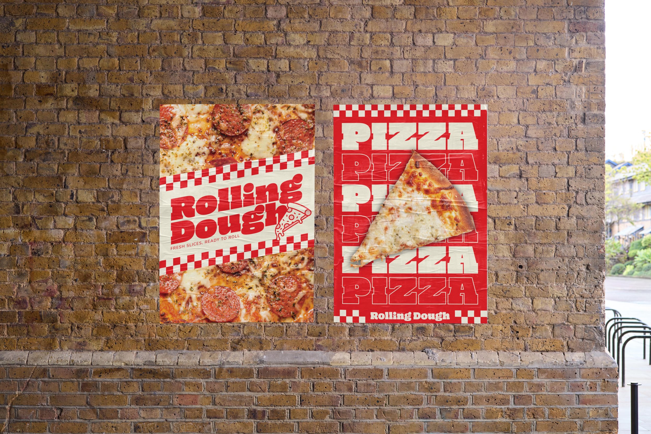
Out in the real world Rolling Dough was designed to grab attention and create moments people want to be part of. The van acts as a moving billboard that proudly shows off the brand’s bold style and playful personality while clearly communicating what it’s all about. Paired with eye-catching posters and merch drops that feel fresh and exclusive the brand invites people to connect, share and become part of the Rolling Dough community wherever it rolls up.